Exploratory Data Analysis (EDA) with Python
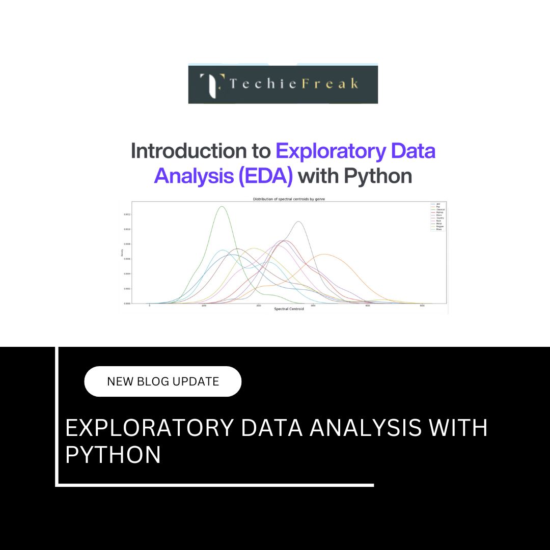
Exploratory Data Analysis (EDA) is a fundamental step in the data science process. It involves summarizing the main characteristics of a dataset using both visual and quantitative methods. The goal of EDA is to gain insights, detect patterns, identify anomalies, and understand relationships between variables before applying machine learning models.
In this guide, we will perform a comprehensive EDA on the Titanic dataset using Python.
Dataset Used: Titanic (from Seaborn)
We will use the Titanic dataset available through the Seaborn library.
import seaborn as sns
import pandas as pd
import matplotlib.pyplot as plt

# Load dataset
df = sns.load_dataset('titanic')
df.head()
1. Understanding the Dataset
The first step in EDA is to understand the structure of the dataset, including data types, missing values, and summary statistics.
df.info()
df.describe(include='all')
Observations:
- Numerical columns: age, fare, sibsp, parch
- Categorical columns: sex, embarked, class, who
- Target variable: survived
- Presence of missing values in columns like age, embarked, and deck
2. Univariate Analysis
This involves analyzing the distribution of individual variables.
a. Age Distribution
plt.figure(figsize=(8, 5))
sns.histplot(df['age'].dropna(), kde=True, bins=30)
plt.title("Age Distribution")
plt.xlabel("Age")
plt.ylabel("Frequency")
plt.show()
The distribution shows the age spread of passengers. The KDE curve helps understand skewness and peak points.
b. Passenger Class Distribution
sns.countplot(data=df, x='pclass')
plt.title("Passenger Class Count")
plt.xlabel("Passenger Class")
plt.ylabel("Number of Passengers")
plt.show()
This chart shows how many passengers belonged to each travel class.
3. Bivariate Analysis
This step focuses on examining relationships between two variables.
a. Survival Count by Gender
sns.countplot(data=df, x='sex', hue='survived')
plt.title("Survival Count by Gender")
plt.xlabel("Gender")
plt.ylabel("Count")
plt.legend(labels=["Not Survived", "Survived"])
plt.show()
This visualization reveals gender-based survival differences.
b. Fare Distribution by Class
sns.boxplot(data=df, x='pclass', y='fare')
plt.title("Fare Distribution by Class")
plt.xlabel("Passenger Class")
plt.ylabel("Fare")
plt.show()
This boxplot helps detect variability and outliers in fare across classes.
4. Multivariate Analysis
Involves analyzing interactions between more than two variables.
a. Pairwise Relationships
sns.pairplot(df[['age', 'fare', 'pclass', 'survived']].dropna(), hue='survived')
plt.suptitle("Pairwise Relationships", y=1.02)
plt.show()
This plot shows relationships between numerical variables and how they differ by survival status.
b. Correlation Heatmap
plt.figure(figsize=(8, 6))
sns.heatmap(df.corr(numeric_only=True), annot=True, cmap='coolwarm', linewidths=0.5)
plt.title("Correlation Heatmap")
plt.show()
The heatmap quantifies the linear correlation between numerical variables.
5. Missing Values Visualization
Visualizing missing data helps identify patterns and plan data cleaning.
import missingno as msno

msno.matrix(df)
plt.show()

msno.heatmap(df)
plt.show()
The matrix and heatmap show which columns have missing values and how those values are related.
6. Outlier Detection
Outliers can distort statistical analyses and modeling results.
Box Plot for Fare
sns.boxplot(x=df['fare'])
plt.title("Boxplot for Fare")
plt.show()
This boxplot reveals that a few passengers paid significantly higher fares than others, which are considered outliers.
7. Distribution Check and Normality Test
Checking if variables like age follow a normal distribution can be useful for some machine learning algorithms.
sns.histplot(df['age'].dropna(), kde=True)
plt.title("Age Distribution")
plt.show()

from scipy.stats import skew, kurtosis

print("Skewness:", skew(df['age'].dropna()))
print("Kurtosis:", kurtosis(df['age'].dropna()))
- Skewness measures asymmetry. A skew value > 0 indicates right skew; < 0 indicates left skew.
- Kurtosis measures the peakedness of the distribution.
Summary of EDA Tasks and Purposes
| EDA Task | Purpose |
|---|---|
| Univariate Analysis | Understand distribution of individual variables |
| Bivariate Analysis | Identify relationships between two variables |
| Multivariate Analysis | Analyze interactions among multiple features |
| Outlier Detection | Detect and handle anomalies that can skew analysis or models |
| Missing Value Analysis | Visualize and strategize imputation or removal |
| Distribution Check | Validate assumptions of modeling techniques such as linear regression |
Conclusion
EDA serves as the foundation for any data-driven project. It offers an opportunity to develop a deep understanding of the dataset, identify potential issues, and generate hypotheses for further analysis or modeling. Without thorough EDA, the risk of misinterpreting data or building inaccurate models significantly increases.
By combining visualizations with statistical analysis, you can uncover insights that lead to better decision-making and model performance.
If needed, the next logical step would be to preprocess this dataset, handle missing values, engineer new features, and prepare the data for machine learning.





.jpg)













.jpg)


.png)
.png)
.png)
.png)
.png)
.png)
.png)
.png)
.png)
.png)
.png)
.png)
.png)
.png)
.png)
.png)
.png)
.png)
.png)
.png)
.png)
.png)
.png)
.png)
.png)
.png)
.png)
.png)
.png)
.png)
.png)
.png)

.png)


