Data Visualization with AI
Data visualization is not just about creating pretty charts — it's about uncovering patterns, highlighting anomalies, and communicating insights effectively. In the context of AI, good visualization is often the bridge between raw data and actionable intelligence.
In this blog, we’ll explore:
- What is Data Visualization?
- Why Visualization Matters in AI and Machine Learning
- Key Visualization Libraries in Python
- Visualizing Data with Seaborn, Matplotlib & Plotly
- Advanced AI-Powered Visualization Tools
1. What is Data Visualization?
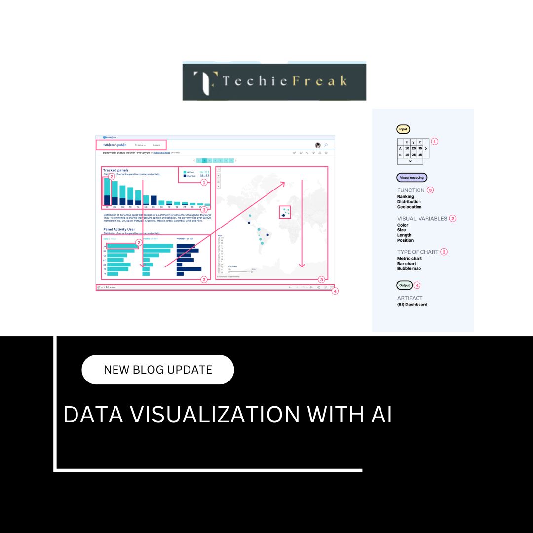
Data Visualization is the process of representing data in a visual format—such as charts, graphs, histograms, heatmaps, scatter plots, or interactive dashboards—to make complex information easier to understand.
Instead of reading rows and columns of raw numbers, visualizations allow us to quickly spot trends, compare values, identify patterns, and highlight outliers.
For example:
- A line chart can show how sales changed over time.
- A bar graph can compare the revenue of different departments.
- A heatmap can reveal areas of high or low activity in user behavior.
The ultimate goal of data visualization is to make data-driven insights more accessible, so better decisions can be made faster.
2. Why Data Visualization Matters in AI
When working with AI models, especially during Exploratory Data Analysis (EDA) and model evaluation, visualization helps:
- Identify correlations and patterns
- Detect outliers and anomalies
- Understand feature distributions
- Validate model performance
- Communicate findings to stakeholders
In short, visualization enhances both the accuracy and transparency of the AI lifecycle.
3. Popular Data Visualization Libraries in Python
Here are the most commonly used libraries:
| Library | Description |
|---|---|
| Matplotlib | Low-level but highly customizable plotting |
| Seaborn | Built on top of Matplotlib for statistical plots |
| Plotly | Interactive web-based visualizations |
| Pandas Plot | Quick visualizations from DataFrames |
| Altair | Declarative statistical visualization library |
4. Practical Examples Using the Titanic Dataset
a. Bar Plot – Survival Count
sns.countplot(x='survived', data=df)
plt.title('Survival Count')
plt.xlabel('Survived (0 = No, 1 = Yes)')
plt.ylabel('Number of Passengers')
plt.show()
What it shows:
This bar plot shows how many passengers survived (1) and how many did not (0).
Why it’s useful:
It gives a quick sense of class imbalance — for example, if far fewer people survived than didn’t, a model trained on this data may need techniques to handle that imbalance.
b. Histogram – Age Distribution
sns.histplot(df['age'].dropna(), kde=True, bins=30)
plt.title('Age Distribution of Passengers')
plt.xlabel('Age')
plt.show()
What it shows:
A histogram shows how ages are distributed across passengers, with a KDE (Kernel Density Estimation) curve to highlight the overall shape.
Why it’s useful:
It helps identify which age groups were most common, and whether the distribution is skewed, bimodal, or normal. This could guide feature engineering decisions (like creating age groups).
c. Heatmap – Correlation Matrix
df['sex'] = df['sex'].map({'male': 0, 'female': 1})
df_corr = df[['survived', 'pclass', 'sex', 'age', 'fare']]

sns.heatmap(df_corr.corr(), annot=True, cmap='coolwarm', fmt='.2f')
plt.title('Correlation Heatmap')
plt.show()
What it shows:
This heatmap displays correlation values between selected numeric features.
Why it’s useful:
It helps you spot relationships like:
- Higher fare = higher survival rate
- Females had higher survival rates (since sex is encoded as 1 for female)
You can also detect multicollinearity (features highly correlated with each other), which can affect model performance.
d. Box Plot – Age vs. Passenger Class
sns.boxplot(x='pclass', y='age', data=df)
plt.title('Age Distribution by Passenger Class')
plt.xlabel('Passenger Class')
plt.ylabel('Age')
plt.show()
What it shows:
This plot visualizes age distribution across the 1st, 2nd, and 3rd class passengers.
Why it’s useful:
Box plots show median, quartiles, and outliers.
You might discover that 1st class passengers tend to be older, possibly reflecting wealthier, older individuals traveling, while 3rd class had younger passengers.
e. Scatter Plot – Fare vs Age (Colored by Survival)
sns.scatterplot(x='age', y='fare', hue='survived', data=df)
plt.title('Fare vs Age with Survival Status')
plt.xlabel('Age')
plt.ylabel('Fare')
plt.show()
What it shows:
Each point represents a passenger, with age on the x-axis and fare on the y-axis. The color indicates whether the person survived.
Why it’s useful:
Scatter plots help identify clusters, trends, or unusual values.
Here, you may observe:
- Passengers who paid higher fares generally had higher survival rates.
- Younger passengers with low fares might still have survived — possibly due to being children.
Summary
| Plot Type | What It Shows | Why It’s Useful |
|---|---|---|
| Bar Plot | Survival counts | Checks for class imbalance |
| Histogram | Age distribution | Reveals skewness, normality, or gaps in data |
| Heatmap | Correlation between variables | Spot multicollinearity and useful relationships |
| Box Plot | Distribution comparison across categories | Shows outliers and variation by group |
| Scatter Plot | Distribution of two features + hue | Identifies patterns, clusters, and survival regions |
5. Interactive Visualization with Plotly
What is Plotly?
Plotly is a graphing library that enables the creation of interactive, dynamic, and visually rich plots. Unlike static charts from Matplotlib or Seaborn, Plotly charts allow users to:
- Zoom in/out
- Hover to see tooltips
- Pan across the graph
- Export/download charts
- Filter or highlight data in real time
Installing Plotly
If you don’t have it installed yet:
pip install plotly
Practical Example – Titanic Dataset
Here’s your example again with a full breakdown:
import plotly.express as px
import seaborn as sns

# Load the Titanic dataset
df = sns.load_dataset('titanic')

# Create an interactive scatter plot
fig = px.scatter(df,
                 x='age',
                 y='fare',
                 color='survived',
                 title='Fare vs Age (Interactive)',
                 labels={'fare': 'Ticket Fare', 'age': 'Passenger Age', 'survived': 'Survival Status'},
                 hover_data=['sex', 'pclass', 'embarked'])

fig.show()
What’s Happening in This Chart?
| Element | Description |
|---|---|
| x='age' | Age is on the x-axis |
| y='fare' | Fare is on the y-axis |
| color='survived' | Color of dots represents whether the person survived (0 or 1) |
| hover_data | When you hover over a point, you’ll also see sex, pclass, and embarked |
| labels | Custom axis and legend labels |
| title | The chart title |
Why Use Plotly?
1. Client Presentations
Instead of just showing a static screenshot, give clients something they can interact with — hover over data points, zoom into dense areas, or explore specific patterns.
2. Exploratory Data Analysis (EDA)
When exploring unfamiliar datasets, Plotly allows you to interact with the data. For example, you might spot:
- Outliers in fare for very young passengers.
- Dense clusters in low-fare, low-age ranges.
- High-fare individuals with high survival rates.
3. Dashboards
Plotly integrates well with Dash, Streamlit, or Flask to create live dashboards where stakeholders can filter data, choose variables, and generate visuals on the fly.
4. Data Storytelling
Plotly allows you to create narrative-driven visuals where insights are not just shown but experienced — like interactive plots embedded in reports or web apps.
Other Plot Types in Plotly
Plotly Express supports a variety of chart types with minimal code:
- px.bar() for bar plots
- px.box() for box plots
- px.line() for time series
- px.histogram() for distributions
- px.pie() for categorical data
- px.violin(), px.density_heatmap(), and more
Example:
fig = px.histogram(df, x='age', nbins=30, title='Age Distribution')
fig.show()
6. AI-Powered Visualization Tools
Some modern tools use AI and automation to simplify visualization and provide smart suggestions:
| Tool | Features |
|---|---|
| Tableau | AI-powered dashboards, forecasting, natural language queries |
| Power BI | Microsoft’s business intelligence platform with ML integration |
| Google Data Studio | Free tool for visualizing AI/ML model results and metrics |
| DataRobot | Automated machine learning with integrated visual explanation tools |
| Yellowbrick | ML visualization library for scikit-learn models (feature importance, residuals, etc.) |
Summary Table
| Task | Best Visualization Type |
|---|---|
| Compare categories | Bar Plot, Count Plot |
| Understand distributions | Histogram, KDE Plot |
| Analyze relationships | Scatter Plot, Pair Plot |
| Explore correlations | Heatmap |
| Understand variance | Box Plot, Violin Plot |
| Show predictions or output | Interactive Plotly Charts |
Conclusion
Visualization is an essential step in the AI pipeline. It gives clarity to the data, helps build better models, and makes insights accessible to all.
Before jumping to complex modeling, always remember:
Visualize first, model second.
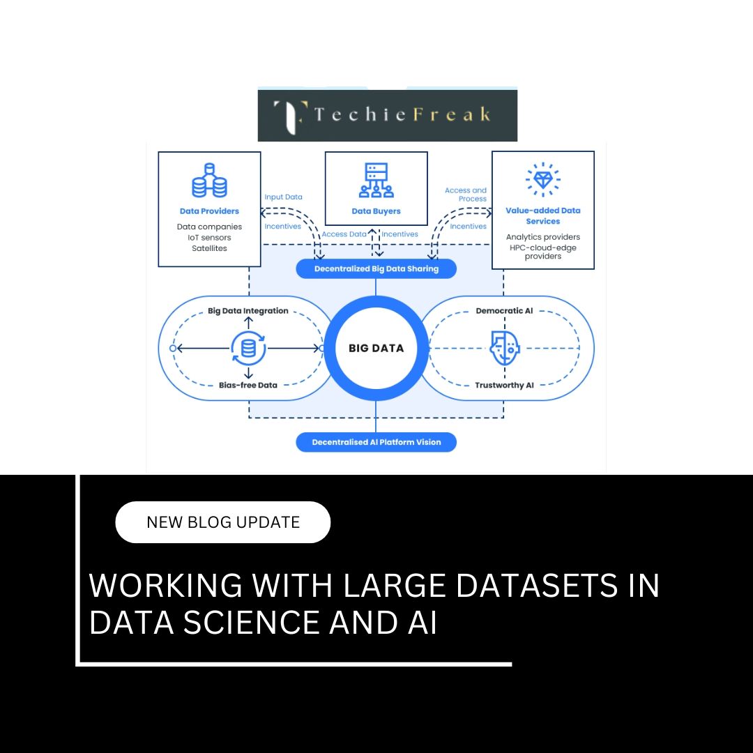
Next Blog- Working with Large Datasets in Data Science and AI


.jpg)


.jpg)


.png)
.png)
.png)
.png)
.png)
.png)
.png)
.png)
.png)
.png)
.png)
.png)
.png)
.png)
.png)
.png)
.png)
.png)
.png)
.png)
.png)
.png)
.png)
.png)
.png)
.png)
.png)
.png)
.png)
.png)
.png)
.png)
.png)