Visualization Tools in AI: Matplotlib and Seaborn
In Artificial Intelligence (AI) and Machine Learning (ML), the ability to visualize data and model behavior is not just a luxury — it’s a necessity. Visualization helps researchers and practitioners understand trends, identify patterns, and debug models. Two of the most widely used Python libraries for data visualization are Matplotlib and Seaborn. This guide explores both in depth, focusing on their use in AI contexts.
1. Matplotlib
What is Matplotlib?
Matplotlib is a 2D plotting library in Python that allows users to generate plots, histograms, bar charts, scatter plots, and more with just a few lines of code. It serves as the foundation for many other visualization libraries, including Seaborn, Plotly, and Pandas’ built-in plotting functions.
It was initially created to replicate MATLAB’s plotting capabilities in Python, making it especially popular in scientific and academic communities.
Key Features of Matplotlib
a. Versatile Plotting Options
Matplotlib provides a wide array of plot types:
- Line plots (for trends over time or iterations)
- Bar charts (for comparing categories)
- Histograms (for distribution analysis)
- Scatter plots (for relationship analysis)
- Pie charts (for proportion comparisons)
- Error bars, 3D plots, log-scale plots, and more
b. Highly Customizable
Almost every aspect of a plot is customizable — color, line style, marker shape, axis labels, title, font, tick size, grid, and more. This is crucial in AI when presenting findings in a professional or publishable format.
c. Two Plotting Interfaces
- Pyplot API (procedural): Quick and easy; similar to MATLAB.
- Object-Oriented API: More powerful, suitable for creating complex multi-plot figures with precision.
d. Interactive and Animated Plots
Matplotlib can be integrated with interactive environments like Jupyter Notebook and can produce animated plots to track metrics such as training accuracy/loss over time.
Applications in AI
Matplotlib is extensively used during:
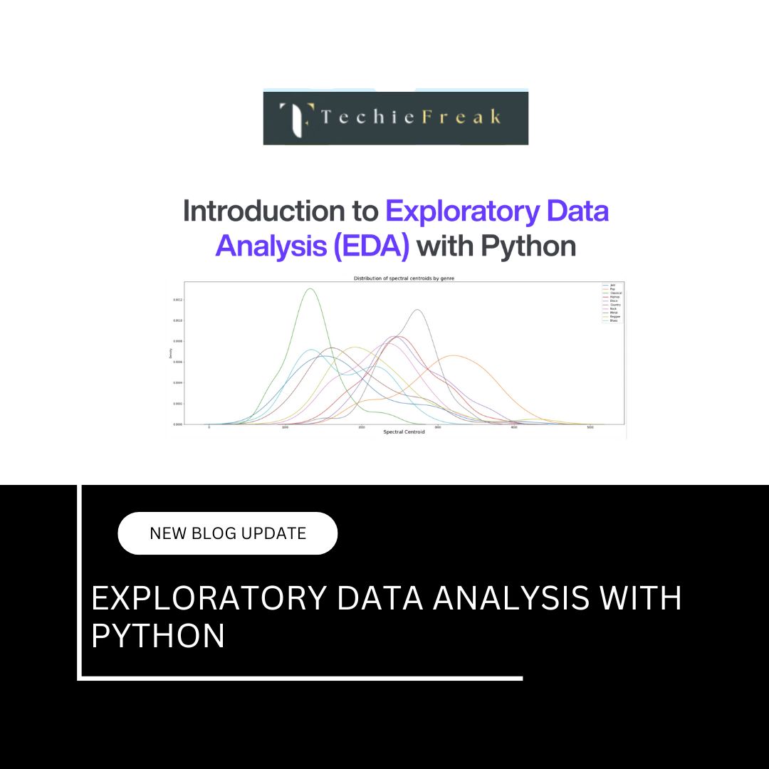
- Exploratory Data Analysis (EDA): Understand structure, distribution, and relationships in the data before training.
- Model Training: Visualize changes in training and validation loss/accuracy across epochs.
- Model Evaluation: Compare true vs predicted values or visualize confusion matrices.
- Hyperparameter Tuning: Plot how changes in parameters impact performance metrics.
Example: Plotting Loss over Epochs
import matplotlib.pyplot as plt

epochs = [1, 2, 3, 4, 5]
train_loss = [0.9, 0.7, 0.5, 0.4, 0.3]
val_loss = [1.0, 0.8, 0.6, 0.5, 0.45]

plt.plot(epochs, train_loss, label='Training Loss', marker='o')
plt.plot(epochs, val_loss, label='Validation Loss', marker='s')
plt.xlabel('Epochs')
plt.ylabel('Loss')
plt.title('Model Loss Over Epochs')
plt.legend()
plt.grid(True)
plt.show()
This kind of plot is essential in diagnosing overfitting or underfitting of AI models.
Limitations of Matplotlib
While powerful, Matplotlib has a few drawbacks:
- Steep learning curve for complex visualizations.
- Less intuitive for statistical plotting (handled better by Seaborn).
- Default themes and styles are basic and often require manual enhancement.
2. Seaborn
What is Seaborn?
Seaborn is a statistical data visualization library built on top of Matplotlib. It simplifies the creation of visually appealing, informative charts. Seaborn’s strength lies in its ability to handle complex datasets and statistical relationships with minimal code.
It was specifically designed to work well with Pandas DataFrames, which are the go-to data structures in AI and data science workflows.
Key Features of Seaborn
a. Advanced Statistical Plotting
Seaborn offers high-level functions for drawing:
- Box plots and violin plots (distribution spread)
- Swarm plots and strip plots (categorical scatter)
- Heatmaps (correlation and matrix data)
- Pair plots (relationship between all feature pairs)
- Regression plots (with optional confidence intervals)
b. Built-in Themes and Palettes
Seaborn automatically applies better-looking styles and themes, making plots more suitable for presentations or publications. You can choose from themes like darkgrid, whitegrid, ticks, and more.
c. Direct Integration with Pandas
Unlike Matplotlib, Seaborn functions are tailored to accept Pandas DataFrames directly, allowing for cleaner, more readable code.
d. Aggregation and Estimation
Seaborn can perform statistical aggregation on data (e.g., mean, median) and automatically display confidence intervals — essential when visualizing AI model predictions or experiments.
Applications in AI
Seaborn is particularly useful for:
- Feature Analysis: Understand feature distributions and correlations before model training.
- Class Distributions: Spot imbalances in classification tasks.
- Visualizing Model Output: Show distributions of predicted vs actual results.
- Multivariate Analysis: Understand interactions between multiple features at once.
Example: Correlation Heatmap for Feature Selection
import seaborn as sns
import pandas as pd
import matplotlib.pyplot as plt

# Sample data
df = sns.load_dataset('iris')

# Compute correlation matrix
corr_matrix = df.corr(numeric_only=True)

# Plot heatmap
sns.heatmap(corr_matrix, annot=True, cmap='coolwarm')
plt.title('Feature Correlation Matrix')
plt.show()
This heatmap helps identify multicollinearity, guiding feature selection in machine learning pipelines.
Example: Pair Plot for Class Separation
sns.pairplot(df, hue='species', diag_kind='kde')
plt.show()
This visual quickly shows how well the classes (species) are separable — which is crucial in classification tasks.
Limitations of Seaborn
- Less control over low-level plot elements (relies on Matplotlib for fine-tuning).
- Slightly slower than Matplotlib for large datasets.
- Fewer options for interactive/animated plots.
Combined Use in AI Workflows
Most AI practitioners use Matplotlib and Seaborn together. For example:
- Use Seaborn for quick statistical exploration and high-level insights.
- Use Matplotlib to fine-tune and customize the resulting plots, or to plot training metrics and performance metrics.
Conclusion
Matplotlib and Seaborn are indispensable tools for AI professionals. They not only make data storytelling easier but also provide the necessary insight required to build robust, interpretable, and trustworthy AI models. While Matplotlib is a powerhouse of customization, Seaborn simplifies statistical plotting — making them a perfect pair in any AI toolkit.
Next Blog- Data Cleaning and Preprocessing
.jpg)


.jpg)


.png)
.png)
.png)
.png)
.png)
.png)
.png)
.png)
.png)
.png)
.png)
.png)
.png)
.png)
.png)
.png)
.png)
.png)
.png)
.png)
.png)
.png)
.png)
.png)
.png)
.png)
.png)
.png)
.png)
.png)
.png)
.png)
.png)