.png)
Implementation of K-Means Clustering in Python
Let’s implement K-Means Clustering in Python with a practical example: segmenting customers based on their spending habits in a shopping mall. We'll use the Mall Customers dataset, where each customer has features like Annual Income and Spending Score.
We’ll group these customers into clusters based on these two features.
Step-by-Step Implementation
Step 1. Import Necessary Libraries
We'll start by importing the necessary libraries: numpy, pandas, scikit-learn for model building, and matplotlib for visualization.
import numpy as np
import pandas as pd
import matplotlib.pyplot as plt
from sklearn.cluster import KMeans
Step 2. Create a Sample Dataset
In this step we will read the data from some of the open repositories like Kaggle dataset, UCI Machine Learning Repository etc and explore the data to understand the features and its importance.
If you don’t have a dataset, you can create a synthetic one or download the Mall Customers dataset online. For simplicity, we’ll create a small dataset.
# Sample dataset
data = {
    'CustomerID': [1, 2, 3, 4, 5, 6, 7, 8, 9, 10],
    'Annual Income (k$)': [15, 16, 17, 24, 25, 70, 75, 80, 85, 90],
    'Spending Score (1-100)': [39, 81, 6, 77, 40, 200, 50, 60, 45, 70]
}

df = pd.DataFrame(data)
print(df)
Output:
   CustomerID  Annual Income (k$)  Spending Score (1-100)
0           1                  15                     39
1           2                  16                     81
2           3                  17                      6
3           4                  24                     77
4           5                  25                     40
5           6                  70                    200
6           7                  75                     50
7           8                  80                     60
8           9                  85                     45
9          10                  90                     70
Step 3.Data Pre-processing for Clustering
Before building the model, we need to pre-process the data. In this pre processing step, we focus on following steps:
- Missing Value Imputation, here we just remove the missing value if any feature has buy its median or Mode.
- Drop the columns which is not impacting the target
- Visualize the relationship between the feature to check if they are highly corelated to each other.
- Check if there is any categorical feature, remove it to numerical feature by applying OHE (One Hot Encoding).
# We are droping the CustomerID column
X = df[['Annual Income (k$)', 'Spending Score (1-100)']].values
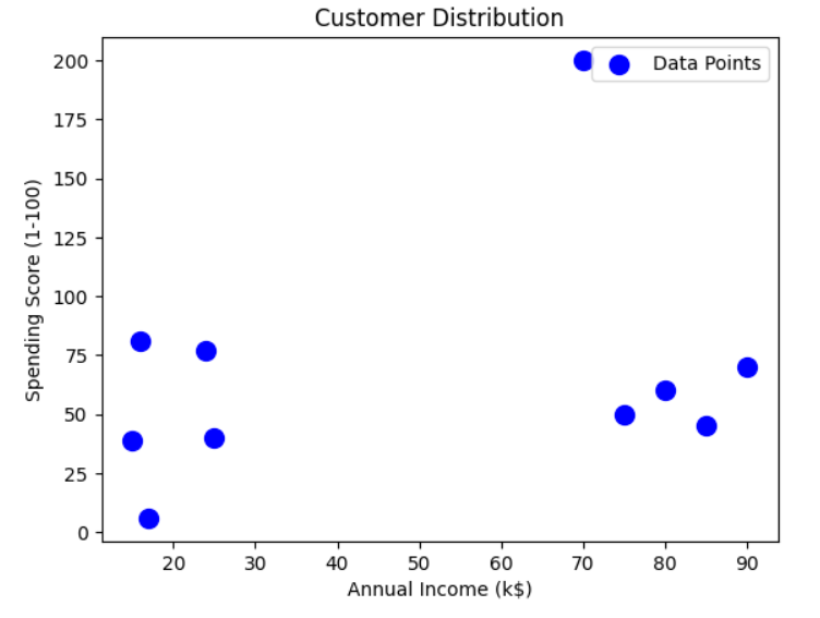
Step 4. Visualize the Data
Let's plot the dataset to understand its distribution.
plt.scatter(X[:, 0], X[:, 1], s=100, c='blue', label='Data Points')
plt.title('Customer Distribution')
plt.xlabel('Annual Income (k$)')
plt.ylabel('Spending Score (1-100)')
plt.legend()
plt.show()
Step 5. Apply K-Means Clustering
- Determine the optimal number of clusters using the Elbow Method.
- Fit the K-Means algorithm and predict clusters.
Elbow Method to determine the optimal value of K
# Determine the optimal number of clusters
wcss = []  # Within-cluster sum of squares
for k in range(1, 11):
    kmeans = KMeans(n_clusters=k, init='k-means++', random_state=42)
    kmeans.fit(X)
    wcss.append(kmeans.inertia_)

# Plot the Elbow graph
plt.plot(range(1, 11), wcss, marker='o')
plt.title('Elbow Method')
plt.xlabel('Number of Clusters')
plt.ylabel('WCSS')
plt.show()
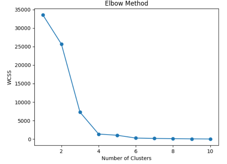
If we Look at the above plot for the "elbow point", where the WCSS curve bends. Let us say the optimal value of K is 3.
Fit K-Means with optimal no of clusters
# Applying K-Means with 3 clusters
kmeans = KMeans(n_clusters=3, init='k-means++', random_state=42)
y_kmeans = kmeans.fit_predict(X)

# Add cluster labels to the DataFrame
df['Cluster'] = y_kmeans
print(df)

OUTPUT:
     CustomerID  Annual Income (k$)  Spending Score (1-100)  Cluster
0           1                  15                      39        2
1           2                  16                      81        0
2           3                  17                       6        2
3           4                  24                      77        0
4           5                  25                      40        2
5           6                  70                     200        1
6           7                  75                      50        0
7           8                  80                      60        0
8           9                  85                      45        0
9          10                  90                      70        0
Step 6. Visualize the Clusters
Plot the clusters and centroids.
# Plot the clusters
plt.scatter(X[y_kmeans == 0, 0], X[y_kmeans == 0, 1], s=100, c='red', label='Cluster 1')
plt.scatter(X[y_kmeans == 1, 0], X[y_kmeans == 1, 1], s=100, c='blue', label='Cluster 2')
plt.scatter(X[y_kmeans == 2, 0], X[y_kmeans == 2, 1], s=100, c='green', label='Cluster 3')

# Plot the centroids
plt.scatter(kmeans.cluster_centers_[:, 0], kmeans.cluster_centers_[:, 1],
            s=200, c='yellow', label='Centroids')

plt.title('Customer Segments')
plt.xlabel('Annual Income (k$)')
plt.ylabel('Spending Score (1-100)')
plt.legend()
plt.show()
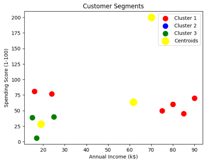
Results
After running the above code:
- Customers are divided into three distinct groups (clusters).
- Each cluster represents a group of customers with similar spending habits and income levels:
- Cluster 1 (Red): Low-income, moderate spending.
- Cluster 2 (Blue): Medium-income, high spending.
- Cluster 3 (Green): High-income, varied spending.
Choosing the Optimal Number of Clusters (K)
Selecting the right number of clusters is crucial. Common methods include:
Choosing the optimal number of clusters (kk) is a critical step in K-Means clustering, as it directly impacts the algorithm's performance and the interpretability of the results. There are several techniques to determine the best kk. Below are the most commonly used methods:
1. The Elbow Method
The Elbow Method evaluates the within-cluster sum of squares (WCSS) for different values of kk. The WCSS measures the variance within each cluster.
Implementation:
from sklearn.cluster import KMeans
import matplotlib.pyplot as plt

# Compute WCSS for different values of k
wcss = []
for k in range(1, 11):
    kmeans = KMeans(n_clusters=k, init='k-means++', random_state=42)
    kmeans.fit(X)
    wcss.append(kmeans.inertia_)

# Plot the Elbow graph
plt.plot(range(1, 11), wcss, marker='o')
plt.title('Elbow Method')
plt.xlabel('Number of Clusters (k)')
plt.ylabel('WCSS')
plt.show()
Interpretation:
- The optimal kk is where the "elbow" appears (e.g., the curve bends significantly).
- Beyond this point, adding more clusters does not significantly reduce WCSS.
2. The Silhouette Method
The Silhouette Method measures how similar a point is to its own cluster compared to other clusters. It provides a score between −1-1 and 11: Below is just the sample code for the Silhouette Method. We are covering its python implementation in different blog.
Implementation:
from sklearn.metrics import silhouette_score

# Compute Silhouette Scores for different values of k
silhouette_scores = []
for k in range(2, 11):  # Silhouette score requires at least 2 clusters
    kmeans = KMeans(n_clusters=k, init='k-means++', random_state=42)
    kmeans.fit(X)
    score = silhouette_score(X, kmeans.labels_)
    silhouette_scores.append(score)

# Plot the Silhouette Scores
plt.plot(range(2, 11), silhouette_scores, marker='o')
plt.title('Silhouette Method')
plt.xlabel('Number of Clusters (k)')
plt.ylabel('Silhouette Score')
plt.show()
Interpretation:
- The optimal kk is the one with the highest Silhouette Score.
- It indicates the best separation between clusters.
3. Davies-Bouldin Index
The Davies-Bouldin Index measures the average similarity ratio of each cluster with the one it is most similar to. Lower values indicate better clustering.Below is just the sample code for the Silhouette Method. We are covering its python implementation in different blog.
Implementation:
from sklearn.metrics import davies_bouldin_score

# Compute Davies-Bouldin Index for different k values
db_scores = []
for k in range(2, 11):
    kmeans = KMeans(n_clusters=k, init='k-means++', random_state=42)
    kmeans.fit(X)
    score = davies_bouldin_score(X, kmeans.labels_)
    db_scores.append(score)

# Plot the Davies-Bouldin Index
plt.plot(range(2, 11), db_scores, marker='o')
plt.title('Davies-Bouldin Index')
plt.xlabel('Number of Clusters (k)')
plt.ylabel('DB Index')
plt.show()
Interpretation:
The optimal kk minimizes the Davies-Bouldin Index.
Next Blog - Python implementation of in K-Means Clustering using the Elbow Method

.png)
.png)
.png)
.png)
.png)
.png)
.png)
.png)
.png)
.png)
.png)
.png)
.png)
.png)
.png)
.png)
.png)
.png)
.png)
.png)
.png)
.png)
.png)