1. Enhancing Visuals with Titles, Labels, and Legends
Visualizations are a powerful way to communicate data, but they must be clear and informative to maximize their impact. Titles, labels, and legends play a crucial role in enhancing a plot’s readability and effectiveness. In this blog, we’ll explore how to add and customize these elements in Matplotlib to make your plots more insightful and visually appealing.
1.1 Why Titles, Labels, and Legends are Important
- Titles: Provide a clear context for the plot, summarizing what the data represents.
- Labels: Help identify what each axis measures (e.g., time, categories, values).
- Legends: Differentiate multiple lines, markers, or categories in a plot.
Without these elements, even a technically accurate plot can be confusing or misinterpreted.
1.2 Adding Titles to Plots
A title is a single line of text displayed above the plot. It gives viewers an immediate understanding of the plot's purpose.
Basic Title Addition
The plt.title() function in Matplotlib is used to add a title to a plot. It places a text string at the top of the plot, helping to provide context or describe what the plot represents.
import matplotlib.pyplot as plt

# Data
x = [1, 2, 3, 4, 5]
y = [10, 20, 25, 30, 35]

# Create the plot
plt.plot(x, y)

# Add a title
plt.title('Sales Over Time')

# Display the plot
plt.show()
Customizing Titles
You can customize the title’s font, size, color, and alignment.
import matplotlib.pyplot as plt

# Data
x = [1, 2, 3, 4, 5]
y = [10, 20, 25, 30, 35]

plt.plot(x, y)
plt.title('Sales Over Time',
          fontsize=16,
          color='blue',
          loc='center')  # loc: 'center', 'left', or 'right'
plt.show()
_1735035741.png)
1.3 Adding Labels to Axes
Axis labels describe the data being measured along the X and Y axes.
Adding Basic Labels
Use plt.xlabel() and plt.ylabel() for X-axis and Y-axis labels, respectively.
import matplotlib.pyplot as plt

# Data
x = [1, 2, 3, 4, 5]
y = [10, 20, 25, 30, 35]
plt.plot(x, y)
plt.xlabel('Months')
plt.ylabel('Sales (in USD)')
plt.title('Monthly Sales')
plt.show()
Customizing Labels
Labels can be styled similarly to titles.
import matplotlib.pyplot as plt

# Data
x = [1, 2, 3, 4, 5]
y = [10, 20, 25, 30, 35]
plt.plot(x, y)
plt.xlabel('Months', fontsize=12, color='green')
plt.ylabel('Sales (in USD)', fontsize=12, color='purple')
plt.title('Monthly Sales', fontsize=14)
plt.show()
_1735035774.png)
1.4 Adding Legends
Legends are essential for distinguishing between multiple data series or categories in a plot.
Adding Legends to a Plot
Use the plt.legend() function to add a legend. Add a label to each plot using the label parameter.
import matplotlib.pyplot as plt

# Data
x = [1, 2, 3, 4, 5]
y1 = [10, 20, 25, 30, 35]
y2 = [15, 18, 22, 27, 33]

plt.plot(x, y1, label='Product A')
plt.plot(x, y2, label='Product B')
plt.xlabel('Months')
plt.ylabel('Sales (in USD)')
plt.title('Product Sales Comparison')
plt.legend()  # Add legend
plt.show()
Customizing Legends
Legends can be placed and styled for better aesthetics.
import matplotlib.pyplot as plt

# Data
x = [1, 2, 3, 4, 5]
y1 = [10, 20, 25, 30, 35]
y2 = [15, 18, 22, 27, 33]

plt.plot(x, y1, label='Product A')
plt.plot(x, y2, label='Product B')

plt.legend(loc='upper left', fontsize=10, title='Products')
plt.xlabel('Months')
plt.ylabel('Sales (in USD)')
plt.title('Product Sales Comparison')
plt.show()
Common Legend Locations:
- 'upper left'
- 'upper right'
- 'lower left'
- 'lower right'
- 'center'
_1735035820.png)
1.5 Combining Titles, Labels, and Legends
Here’s a complete example that incorporates all three elements:
import matplotlib.pyplot as plt

# Data
x = [1, 2, 3, 4, 5]
y1 = [10, 20, 25, 30, 35]
y2 = [15, 18, 22, 27, 33]

plt.plot(x, y1, label='Product A', linestyle='--', marker='o', color='blue')
plt.plot(x, y2, label='Product B', linestyle='-', marker='s', color='red')

# Add title, labels, and legend
plt.title('Monthly Sales Comparison', fontsize=16, color='darkblue')
plt.xlabel('Months', fontsize=12)
plt.ylabel('Sales (in USD)', fontsize=12)
plt.legend(loc='upper left', title='Products', fontsize=10)

# Display the plot
plt.show()
1.6 Advanced Customizations
Changing the Font
You can specify font properties globally for titles, labels, and legends using the rcParams module.
import matplotlib as mpl
import matplotlib.pyplot as plt

# Data
x = [1, 2, 3, 4, 5]
y1 = [10, 20, 25, 30, 35]
y2 = [15, 18, 22, 27, 33]

mpl.rcParams['font.family'] = 'serif'
mpl.rcParams['font.size'] = 12

plt.plot(x, y1, label='Product A')
plt.plot(x, y2, label='Product B')
plt.title('Monthly Sales Comparison')
plt.xlabel('Months')
plt.ylabel('Sales (in USD)')
plt.legend()
plt.show()
Using Subplots with Titles, Labels, and Legends
When dealing with multiple plots in the same figure, you can use plt.subplot() to assign titles, labels, and legends individually.
import matplotlib.pyplot as plt

# Data
x = [1, 2, 3, 4, 5]
y1 = [10, 20, 25, 30, 35]
y2 = [15, 18, 22, 27, 33]

fig, ax = plt.subplots(2, 1)

# First subplot
ax[0].plot(x, y1, label='Product A', color='blue')
ax[0].set_title('Product A Sales')
ax[0].set_xlabel('Months')
ax[0].set_ylabel('Sales (in USD)')
ax[0].legend()

# Second subplot
ax[1].plot(x, y2, label='Product B', color='red')
ax[1].set_title('Product B Sales')
ax[1].set_xlabel('Months')
ax[1].set_ylabel('Sales (in USD)')
ax[1].legend()

plt.tight_layout()
plt.show()
_1735035949.png)
1.7 Practical Use Cases
- Data Storytelling: Clearly explain data trends with proper annotations and descriptions.
- Comparison Charts: Distinguish multiple datasets using legends.
- Professional Reports: Add detailed titles and labels for formal presentations.
- Highlighting Key Points: Use annotations or colored text in legends.
2. Creating Advanced Visualizations with Seaborn
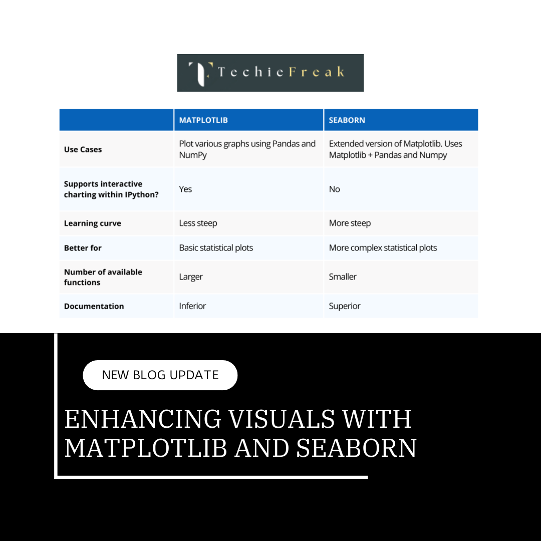
Seaborn is a powerful Python library for creating advanced and aesthetically pleasing data visualizations. Built on top of Matplotlib, it simplifies complex plotting and integrates seamlessly with Pandas for handling data. In this blog, we’ll dive deep into creating advanced visualizations using Seaborn, with step-by-step explanations of theory and practical examples.
What is Seaborn?
Seaborn is a data visualization library that provides:
- High-level interface for drawing attractive statistical graphics.
- Built-in themes and color palettes for better aesthetics.
- Functions for visualizing data relationships, distributions, and categorical data.
Installation: To use Seaborn, install it via pip:
pip install seaborn
Importing Seaborn:
import seaborn as sns
import matplotlib.pyplot as plt
2.1 Setting Up Seaborn
Seaborn includes various themes and styles to enhance the visual appeal of plots.
Default Theme
Seaborn applies a default theme, but you can customize it.
# Apply default Seaborn theme
sns.set_theme()
Custom Themes
You can change the overall appearance of plots using the following themes:
- 'darkgrid': Adds a grid with a dark background.
- 'whitegrid': Adds a grid with a white background.
- 'dark': Dark background without gridlines.
- 'white': White background without gridlines.
- 'ticks': Adds ticks to the plot.
sns.set_theme(style='whitegrid')
2.2 Visualizing Data Distributions
Seaborn provides specialized functions for visualizing data distributions.
Histogram with sns.histplot()
A histogram with sns.histplot() in Seaborn is a visualization that shows the distribution of a numerical dataset. It displays how the data is spread across different intervals (or bins) and is useful for understanding the frequency of data points within those intervals
Histograms display the distribution of numerical data.
import seaborn as sns
import matplotlib.pyplot as plt

# Sample data
data = sns.load_dataset('penguins')

# Create a histogram
sns.histplot(data['flipper_length_mm'], kde=True, bins=30, color='blue')
plt.title('Flipper Length Distribution')
plt.xlabel('Flipper Length (mm)')
plt.ylabel('Frequency')
plt.show()
_1735035989.png)
Kernel Density Estimate (KDE) with sns.kdeplot()
A Kernel Density Estimate (KDE) plot is a smooth, continuous approximation of the probability distribution of a dataset. It provides an estimate of the data's probability density function (PDF) and is particularly useful for visualizing the distribution of data points without the need for binning, as in a histogram.
In Seaborn, sns.kdeplot() is used to create KDE plots. It smooths the data using a kernel (often Gaussian) to estimate the underlying distribution.
import seaborn as sns
import matplotlib.pyplot as plt

# Sample data
data = sns.load_dataset('penguins')
sns.kdeplot(data['flipper_length_mm'], shade=True, color='green')
plt.title('KDE Plot of Flipper Length')
plt.xlabel('Flipper Length (mm)')
plt.show()
_1735036037.png)
2.3 Visualizing Relationships
Scatter Plot with sns.scatterplot()
A scatter plot is a type of plot used to display the relationship between two numerical variables. Each point on the scatter plot represents a pair of values (x, y), showing how one variable is related to the other. This type of plot is particularly useful for identifying correlations, trends, and clusters within the data.
In Seaborn, the sns.scatterplot() function is used to create scatter plots.
import seaborn as sns
import matplotlib.pyplot as plt

# Sample data
data = sns.load_dataset('penguins')
# Scatter plot
sns.scatterplot(data=data, x='bill_length_mm', y='bill_depth_mm', hue='species', style='species', palette='deep')
plt.title('Bill Length vs. Bill Depth')
plt.xlabel('Bill Length (mm)')
plt.ylabel('Bill Depth (mm)')
plt.show()
Line Plot with sns.lineplot()
A line plot is a type of plot used to visualize trends or patterns in data over continuous intervals. It connects individual data points with a line, making it useful for displaying changes in a variable over time or any other continuous scale.
In Seaborn, the sns.lineplot() function is used to create line plots. These plots are ideal for showing trends, seasonality, or patterns in time series or ordered data.
import seaborn as sns
import matplotlib.pyplot as plt

# Sample data
data = sns.load_dataset('penguins')
# Line plot
sns.lineplot(data=data, x='flipper_length_mm', y='body_mass_g', hue='species', palette='coolwarm')
plt.title('Flipper Length vs. Body Mass')
plt.xlabel('Flipper Length (mm)')
plt.ylabel('Body Mass (g)')
plt.show()
_1735036158.png)
2.4 Visualizing Categorical Data
Seaborn excels in visualizing data grouped by categories.
Bar Plot with sns.barplot()
A bar plot is a type of plot used to display categorical data with rectangular bars, where the length or height of each bar represents the aggregated value (often the mean) of the category it corresponds to. Bar plots are useful for comparing the sizes of different categories or groups, and they allow you to easily observe differences between them.
In Seaborn, the sns.barplot() function is used to create bar plots. By default, it computes and displays the mean of each category, but you can specify other aggregations such as median or sum.
import seaborn as sns
import matplotlib.pyplot as plt

# Sample data
data = sns.load_dataset('penguins')
# Bar plot
sns.barplot(data=data, x='species', y='body_mass_g', palette='pastel')
plt.title('Average Body Mass by Species')
plt.xlabel('Species')
plt.ylabel('Body Mass (g)')
plt.show()
_1735036199.png)
Box Plot with sns.boxplot()
A box plot (also known as a box-and-whisker plot) is a type of plot used to summarize the distribution of a dataset. It provides a concise way to visualize the spread of the data and highlights key statistical features such as the median, quartiles, and outliers.
In Seaborn, the sns.boxplot() function is used to create box plots. Box plots are especially useful for understanding the variability of a dataset and identifying outliers.
import seaborn as sns
import matplotlib.pyplot as plt

# Sample data
data = sns.load_dataset('penguins')
# Box plot
sns.boxplot(data=data, x='species', y='body_mass_g', palette='muted')
plt.title('Body Mass Distribution by Species')
plt.xlabel('Species')
plt.ylabel('Body Mass (g)')
plt.show()
_1735036229.png)
Violin Plot with sns.violinplot()
A violin plot is a data visualization that combines aspects of both a box plot and a Kernel Density Estimate (KDE) plot. It provides a deeper understanding of the distribution of the data by showing its probability density along with its summary statistics (like the median and quartiles).
In Seaborn, the sns.violinplot() function is used to create violin plots. This type of plot is especially useful for visualizing the distribution of a continuous variable across different categories.
import seaborn as sns
import matplotlib.pyplot as plt

# Sample data
data = sns.load_dataset('penguins')
# Violin plot
sns.violinplot(data=data, x='species', y='body_mass_g', hue='sex', split=True, palette='Set2')
plt.title('Body Mass Distribution by Species and Sex')
plt.xlabel('Species')
plt.ylabel('Body Mass (g)')
plt.show()
_1735036259.png)
2.5 Advanced Plots
Pair Plot with sns.pairplot()
A pair plot is a type of plot used to visualize pairwise relationships between multiple variables in a dataset. It creates a grid of scatter plots for each pair of variables and displays histograms or KDEs on the diagonal to show the distribution of individual variables. Pair plots are useful for detecting correlations, relationships, and distributions between multiple numerical variables at once.
In Seaborn, the sns.pairplot() function is used to create pair plots. This plot is especially helpful for exploring the relationships between all numerical features in a dataset and understanding how they interact with each other.
import seaborn as sns
import matplotlib.pyplot as plt

# Sample data
data = sns.load_dataset('penguins')
# Pair plot
sns.pairplot(data, hue='species', palette='husl')
plt.show()
_1735036305.png)
Heatmap with sns.heatmap()
A heatmap is a data visualization technique that represents matrix-like data in a graphical format, where individual values are displayed as colors. Heatmaps are particularly useful for visualizing complex data, such as correlation matrices, where patterns, relationships, and trends can be easily observed.
In Seaborn, the sns.heatmap() function is used to create heatmaps. The color intensity represents the value of each cell in the matrix, making it easier to identify high or low values and patterns across variables.
import seaborn as sns
import matplotlib.pyplot as plt

# Sample data
data = sns.load_dataset('penguins')
# Correlation heatmap
corr = data.corr()
sns.heatmap(corr, annot=True, cmap='coolwarm', linewidths=0.5)
plt.title('Feature Correlation Heatmap')
plt.show()
2.6 Customizing Plots
Adjusting Figure Size
Control plot dimensions using plt.figure().
import seaborn as sns
import matplotlib.pyplot as plt

# Sample data
data = sns.load_dataset('penguins')
plt.figure(figsize=(10, 6))
sns.barplot(data=data, x='species', y='body_mass_g', palette='pastel')
plt.title('Customized Bar Plot')
plt.show()
Custom Color Palettes
Use predefined or custom color palettes for styling.
import seaborn as sns
import matplotlib.pyplot as plt

# Sample data
data = sns.load_dataset('penguins')
sns.set_palette('bright')
sns.scatterplot(data=data, x='bill_length_mm', y='bill_depth_mm', hue='species')
plt.show()
Facet Grid for Subplots
Create subplots based on categorical variables with sns.FacetGrid.
import seaborn as sns
import matplotlib.pyplot as plt

# Sample data
data = sns.load_dataset('penguins')
g = sns.FacetGrid(data, col='species', height=4, aspect=1)
g.map(sns.histplot, 'body_mass_g')
plt.show()
2.7 Practical Use Cases
- Exploratory Data Analysis (EDA): Use Seaborn plots to understand distributions, relationships, and trends in datasets.
- Business Reports: Create professional and insightful visualizations for presentations.
- Statistical Analysis: Generate plots to explore and validate hypotheses.
Key Takeaways:
1. Enhancing Visuals with Titles, Labels, and Legends (Matplotlib)
- Titles: Provide plot context and purpose; customize font, size, color, and alignment.
- Labels: Identify axes (e.g., X: Time, Y: Sales); enhance clarity with styling.
- Legends: Distinguish multiple datasets; customize location, title, and font.
- Advanced Customization: Global styling using rcParams and subplot handling.
2. Creating Advanced Visualizations with Seaborn
- Themes and Styles: Choose from Seaborn’s built-in styles like whitegrid or darkgrid.
- Data Distribution: Visualize distributions with histograms, KDE plots, or combined approaches.
- Relationships: Use scatter and line plots to explore variable correlations.
- Categorical Data: Represent categories with bar, box, or violin plots for detailed insights.
- Advanced Plots: Pair plots for multi-variable analysis and heatmaps for correlation matrices.
- Customization: Adjust figure size, color palettes, and create subplots with FacetGrid.
Practical Applications
- EDA: Simplify data exploration with clear, insightful visualizations.
- Business Reports: Enhance presentations with polished, professional plots.
- Statistical Analysis: Validate hypotheses with advanced visual tools.
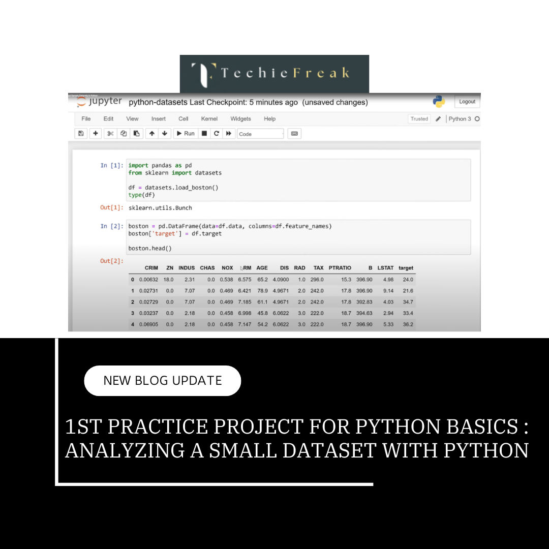
Next Topic : 1st Practice project for Python basics

.png)




.png)
.png)
