Introduction to Matplotlib: Creating Simple Plots
Matplotlib is one of the most popular Python libraries for data visualization. It provides a wide range of tools for creating static, animated, and interactive plots. In this blog, we’ll dive deep into the basics of Matplotlib and learn how to create simple plots to visualize data effectively.
1. What is Matplotlib?
Matplotlib is a Python library for creating 2D plots and graphs. It is highly customizable and integrates seamlessly with other Python libraries such as NumPy and Pandas. The primary module in Matplotlib is pyplot, often imported as plt, which provides functions to create and customize plots.
Why Use Matplotlib?
- Simple to use for basic plotting needs.
- Highly customizable for advanced visualization.
- Supports various plot types (line, bar, scatter, etc.).
- Integrates with other data analysis tools and libraries.
2. Installing Matplotlib
Before using Matplotlib, ensure it's installed in your Python environment:
pip install matplotlib
3. Basic Workflow of Matplotlib
The typical steps for creating a plot using Matplotlib are:
- Import the library.
- Prepare the data.
- Create the plot.
- Customize the plot (optional).
- Display or save the plot.
4. Creating a Simple Line Plot
Line Plot Basics
A line plot is one of the simplest ways to visualize a relationship between two variables.
import matplotlib.pyplot as plt

# Step 1: Prepare the data
x = [1, 2, 3, 4, 5]
y = [2, 4, 6, 8, 10]

# Step 2: Create the plot
plt.plot(x, y)

# Step 3: Add labels and title
plt.xlabel('X-axis')
plt.ylabel('Y-axis')
plt.title('Simple Line Plot')

# Step 4: Display the plot
plt.show()
Explanation:
- plt.plot(x, y): Plots y versus x as a line.
- plt.xlabel(): Adds a label to the X-axis.
- plt.ylabel(): Adds a label to the Y-axis.
- plt.title(): Sets the title of the plot.
- plt.show(): Displays the plot.
Output:
A line graph showing a straight line increasing as x and y values increase.
_1735034036.png)
5. Customizing Plots
Matplotlib allows extensive customization of plots to make them visually appealing and informative.
5.1 Customizing Line Style, Color, and Markers
import matplotlib.pyplot as plt

# Step 1: Prepare the data
x = [1, 2, 3, 4, 5]
y = [2, 4, 6, 8, 10]

plt.plot(x, y, color='red', linestyle='--', marker='o', label='Line 1')
plt.legend()  # Add legend to the plot
plt.show()
- color: Sets the line color (e.g., 'red', 'blue').
- linestyle: Defines the line style (e.g., '--' for dashed, '-' for solid).
marker: Specifies markers for data points (e.g., 'o', '*', 's').
_1735034072.png)
6. Adding Multiple Lines
You can plot multiple lines on the same graph:
import matplotlib.pyplot as plt

# Step 1: Prepare the data
x = [1, 2, 3, 4, 5]
y = [2, 4, 6, 8, 10]
y2 = [1, 3, 5, 7, 9]
plt.plot(x, y, label='Line 1')
plt.plot(x, y2, label='Line 2', color='green', linestyle=':')
plt.legend()  # Display the legend
plt.title('Multiple Lines Plot')
plt.show()
_1735034109.png)
7. Adding Annotations
Annotations can highlight specific points or areas in the plot:
import matplotlib.pyplot as plt

# Step 1: Prepare the data
x = [1, 2, 3, 4, 5]
y = [2, 4, 6, 8, 10]
plt.plot(x, y)
plt.annotate('Max Point', xy=(5, 10), xytext=(4, 9),
             arrowprops=dict(facecolor='black', shrink=0.05))
plt.show()
- xy: Coordinates of the point to annotate.
- xytext: Position of the annotation text.
arrowprops: Properties of the arrow pointing to the annotated point.
_1735034206.png)
8. Types of Plots
8.1 Scatter Plot
import matplotlib.pyplot as plt

# Step 1: Prepare the data
x = [1, 2, 3, 4, 5]
y = [2, 4, 6, 8, 10]
plt.scatter(x, y, color='purple')
plt.title('Scatter Plot')
plt.show()
_1735034195.png)
8.2 Bar Plot
import matplotlib.pyplot as plt

categories = ['A', 'B', 'C', 'D']
values = [5, 7, 3, 8]
plt.bar(categories, values, color='orange')
plt.title('Bar Plot')
plt.show()
_1735034260.png)
8.3 Histogram
import numpy as np
import matplotlib.pyplot as plt

data = np.random.randn(1000)
plt.hist(data, bins=20, color='blue')
plt.title('Histogram')
plt.show()
_1735034305.png)
8.4 Pie Chart
import matplotlib.pyplot as plt

sizes = [30, 20, 25, 25]
labels = ['Category A', 'Category B', 'Category C', 'Category D']
plt.pie(sizes, labels=labels, autopct='%1.1f%%')
plt.title('Pie Chart')
plt.show()
_1735034340.png)
9. Saving Plots
You can save plots as image files using plt.savefig():
import matplotlib.pyplot as plt

# Step 1: Prepare the data
x = [1, 2, 3, 4, 5]
y = [2, 4, 6, 8, 10]
plt.plot(x, y)
plt.title('Saved Plot')
plt.savefig('line_plot.png', dpi=300, bbox_inches='tight')
plt.show()
- dpi: Sets the resolution of the saved image.
bbox_inches: Ensures no clipping of the plot edges.
_1735034378.png)
10. Practical Use Cases
- Data Trends: Line plots to analyze trends over time.
- Comparisons: Bar plots to compare different categories.
- Distributions: Histograms to visualize data distributions.
- Proportions: Pie charts to show proportions of categories.
Key Takeaways
- Matplotlib: A versatile library for 2D plotting in Python.
- Basic Workflow: Import, prepare data, create plot, customize, and display/save.
- Customizations: Modify line styles, colors, markers, and add annotations for better visualization.
- Plot Variety: Supports multiple plot types like line, scatter, bar, and pie charts.
- Use Cases: Essential for exploring and presenting data in data analysis workflows.
By mastering Matplotlib, you can create informative and visually appealing plots, making your data analysis more effective and impactful.
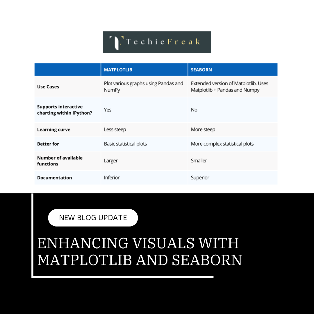
Next Topic : Enhancing Visuals with Matplotlib and Seaborn
.png)



.png)





.png)

