Visualizing Trends in a Dataset with Matplotlib and Seaborn
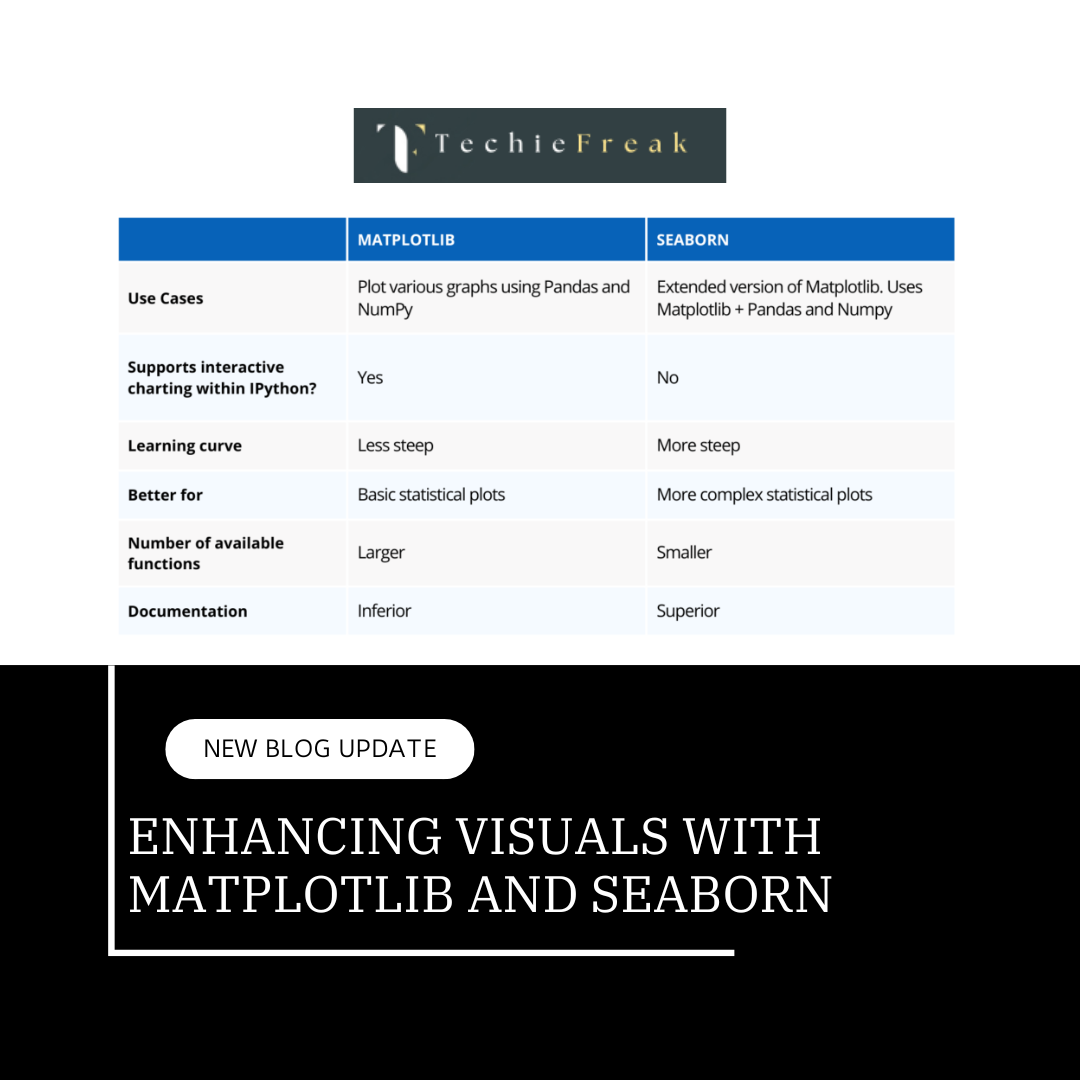
Data visualization is a crucial step in data analysis and machine learning. It helps you understand trends, patterns, and outliers in your dataset, enabling better decision-making and feature engineering. In this blog, we’ll explore the process of creating insightful visualizations using Matplotlib and Seaborn, two popular Python libraries for data visualization.
Objective
By the end of this project, you will:
- Understand how to use Matplotlib and Seaborn for data visualization.
- Create visualizations that highlight key trends in datasets.
- Combine visual insights with narrative to tell a compelling data story.
Step 1: Setup and Preparation
1.1 Install Required Libraries
Ensure Matplotlib and Seaborn are installed in your environment.
pip install matplotlib seaborn
1.2 Import Libraries
import pandas as pd
import matplotlib.pyplot as plt
import seaborn as sns
1.3 Load the Dataset
We’ll use the Titanic dataset for this project. Download it from Kaggle.
# Load Titanic dataset
data = pd.read_csv('titanic.csv')
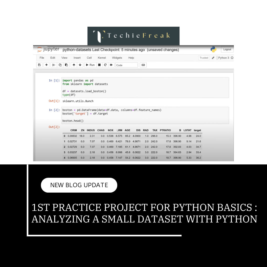
data.head()
Step 2: Basic Visualizations with Matplotlib
2.1 Age Distribution
Visualizing the age distribution helps identify the demographic spread of passengers.
plt.figure(figsize=(10, 6))
plt.hist(data['Age'].dropna(), bins=30, color='blue', alpha=0.7, edgecolor='black')
plt.title('Age Distribution of Titanic Passengers', fontsize=16)
plt.xlabel('Age', fontsize=12)
plt.ylabel('Frequency', fontsize=12)
plt.grid(axis='y', linestyle='--', alpha=0.7)
plt.show()
Insight:
The plot shows a higher concentration of younger passengers, with fewer older individuals aboard.
2.2 Survival by Passenger Class
# Bar plot of survival rates by class
survival_by_class = data.groupby('Pclass')['Survived'].mean()

plt.figure(figsize=(8, 5))
plt.bar(survival_by_class.index, survival_by_class.values, color='green', alpha=0.8)
plt.title('Survival Rates by Passenger Class', fontsize=16)
plt.xlabel('Passenger Class', fontsize=12)
plt.ylabel('Survival Rate', fontsize=12)
plt.xticks(ticks=[1, 2, 3], labels=['First Class', 'Second Class', 'Third Class'])
plt.show()
Insight:
First-class passengers had significantly higher survival rates than those in third class, likely due to better access to lifeboats.
Step 3: Advanced Visualizations with Seaborn
3.1 Survival by Gender
Using a bar plot to compare survival rates between genders.
plt.figure(figsize=(8, 5))
sns.barplot(x='Sex', y='Survived', data=data, palette='coolwarm')
plt.title('Survival Rates by Gender', fontsize=16)
plt.xlabel('Gender', fontsize=12)
plt.ylabel('Survival Rate', fontsize=12)
plt.show()
Insight:
Females had a much higher survival rate than males, reflecting the “women and children first” policy.
3.2 Fare vs. Age with Survival
Scatter plots allow us to visualize the relationship between two numerical features.
plt.figure(figsize=(10, 6))
sns.scatterplot(x='Age', y='Fare', hue='Survived', data=data, palette='viridis', alpha=0.7)
plt.title('Fare vs. Age with Survival Status', fontsize=16)
plt.xlabel('Age', fontsize=12)
plt.ylabel('Fare', fontsize=12)
plt.legend(title='Survived', loc='upper right')
plt.show()
Insight:
Survivors were spread across different age groups, but higher fares were generally associated with a better chance of survival.
3.3 Correlation Heatmap
Heatmaps are powerful tools to identify correlations between numerical variables.
plt.figure(figsize=(12, 8))
correlation_matrix = data.corr()
sns.heatmap(correlation_matrix, annot=True, cmap='coolwarm', linewidths=0.5)
plt.title('Correlation Heatmap', fontsize=16)
plt.show()
Insight:
The heatmap highlights strong correlations, such as the relationship between Pclass and Fare or Parch and Survived.
Step 4: Custom Visualizations for Trends
4.1 Distribution of Survivors by Age and Class
plt.figure(figsize=(10, 6))
sns.boxplot(x='Pclass', y='Age', hue='Survived', data=data, palette='Set2')
plt.title('Age Distribution of Survivors by Passenger Class', fontsize=16)
plt.xlabel('Passenger Class', fontsize=12)
plt.ylabel('Age', fontsize=12)
plt.legend(title='Survived')
plt.show()
Insight:
Younger passengers in first class had higher survival rates than their counterparts in third class.
4.2 Stacked Bar Chart for Embarkation Points and Survival
embarked_survival = pd.crosstab(data['Embarked'], data['Survived'], normalize='index') * 100
embarked_survival.plot(kind='bar', stacked=True, color=['red', 'blue'], figsize=(10, 6))
plt.title('Survival Rates by Embarkation Point', fontsize=16)
plt.xlabel('Embarkation Point', fontsize=12)
plt.ylabel('Percentage', fontsize=12)
plt.legend(['Did Not Survive', 'Survived'], loc='upper right')
plt.show()
Insight:
Passengers embarking from certain points (e.g., Cherbourg) had better survival rates than others.
Step 5: Combining Visualizations for Reporting
Create a visual narrative by combining plots:
- Start with demographic insights (age distribution, gender-based survival).
- Move to relationships (fare vs. age, class-based survival).
- End with actionable insights (heatmaps, embarkation trends).
Key Takeaways
- Understand Your Dataset Visually: Use simple plots to grasp data distribution and structure.
- Visualize Relationships: Scatter plots and bar charts are effective for understanding feature interactions.
- Heatmaps Are Powerful: Use them to identify correlations and prioritize features for machine learning models.
- Combine Insights: A cohesive visual narrative strengthens your understanding of data trends.
- Iteration is Key: Try different plots to uncover hidden patterns in your data.
This project is a stepping stone to understanding how to visualize and interpret data. Mastering visualization techniques will not only enhance your analytical skills but also prepare you for more complex machine learning tasks.
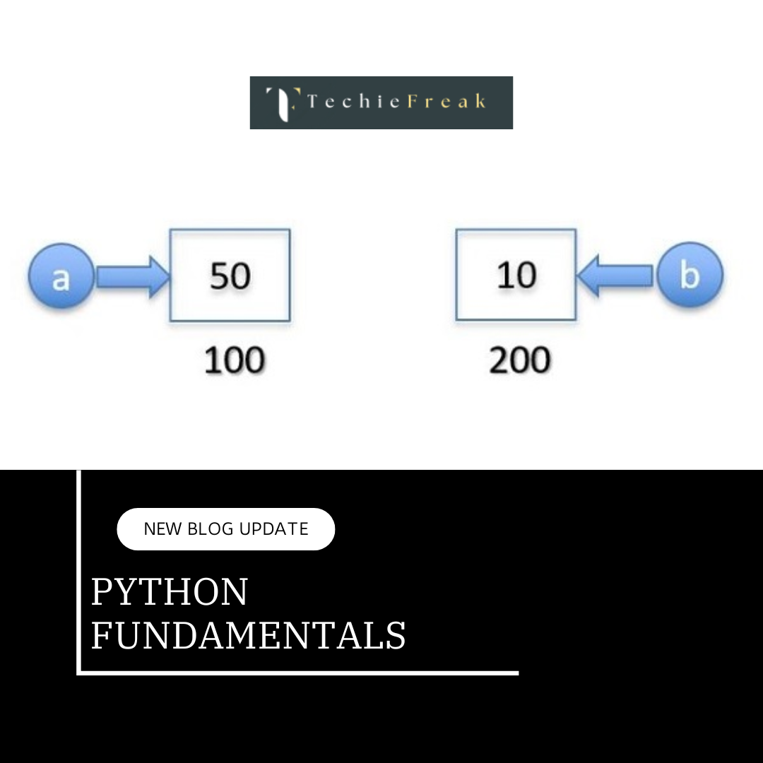
By this we will end our journey for understanding Basics of Python required for Machine Learning.
Now we will move ahead and Master the math behind the machines! Our first topic on mathematics simplifies the essentials of Linear Algebra, the backbone of Machine Learning, to help you build a strong foundation for advanced AI concepts.
Next Topic : Linear Algebra Basics

.png)





.png)
.png)
