.png)
Python implementation of the Silhouette Method
The Silhouette Method is another popular technique for evaluating the quality of clustering in K-Means Clustering. It provides a measure of how similar a point is to its own cluster (cohesion) compared to other clusters (separation). A higher Silhouette Score indicates better-defined clusters.
Here is a step-by-step Python implementation of the Silhouette Method in K-Means Clustering:
Step 1: Import Required Libraries
We'll start by importing the necessary libraries: numpy, pandas, scikit-learn for model building, and matplotlib for visualization.
import numpy as np
import matplotlib.pyplot as plt
from sklearn.cluster import KMeans
from sklearn.metrics import silhouette_score
from sklearn.datasets import make_blobs
Step 2: Generate or Load Data
Create synthetic data using make_blobs or read the data from some of the open repositories like Kaggle dataset, UCI Machine Learning Repository etc and explore the data to understand the features and its importance.
# Generate synthetic data for clustering
X, y = make_blobs(n_samples=300, centers=4, cluster_std=1.0, random_state=42)
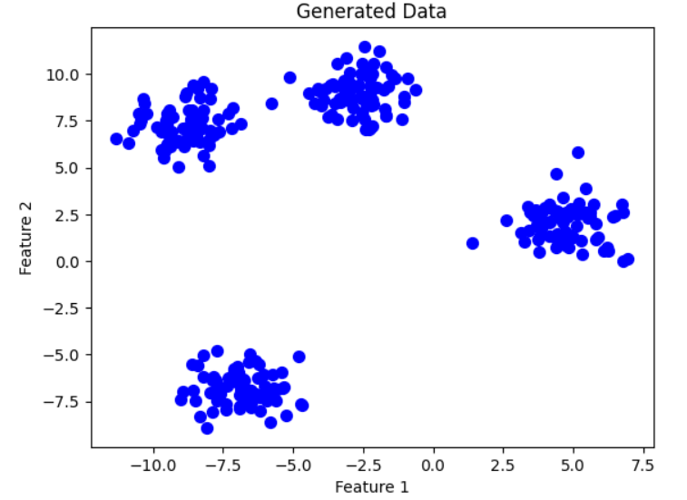
Step 3: Visualize the Data (Optional)
Plot the dataset to understand its structure.
plt.scatter(X[:, 0], X[:, 1], s=50, c='blue')
plt.title("Generated Data")
plt.xlabel("Feature 1")
plt.ylabel("Feature 2")
plt.show()
Step 4: Compute Silhouette Scores for Different Cluster Numbers
Loop through a range of cluster values, compute K-Means clustering, and calculate the Silhouette Score for each.
silhouette_scores = []

# Try K values from 2 to 10 (minimum K is 2 for Silhouette Score)
for k in range(2, 11):
    kmeans = KMeans(n_clusters=k, init='k-means++', random_state=42)
    kmeans.fit(X)
    labels = kmeans.labels_  # Cluster labels
    score = silhouette_score(X, labels)  # Compute Silhouette Score
    silhouette_scores.append(score)
Step 5: Plot the Silhouette Scores
Plot the Silhouette Scores for different numbers of clusters.
plt.figure(figsize=(8, 5))
plt.plot(range(2, 11), silhouette_scores, marker='o', linestyle='--', color='b')
plt.title('Silhouette Method for Optimal K')
plt.xlabel('Number of Clusters (K)')
plt.ylabel('Silhouette Score')
plt.xticks(range(2, 11))
plt.show()
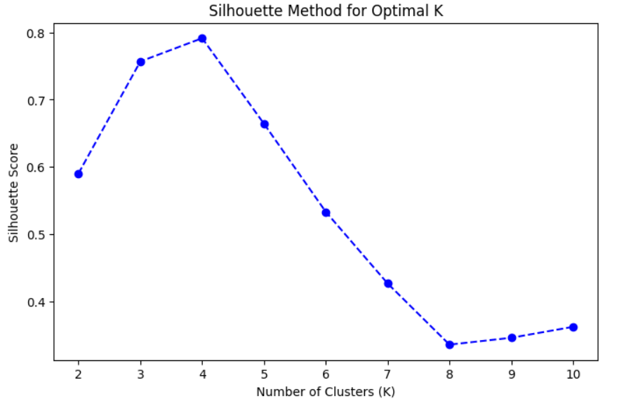
Step 6: Identify the Optimal Number of Clusters
The optimal number of clusters corresponds to the highest Silhouette Score. Inspect the plot or programmatically find the maximum score.
Interpretation:
- The optimal kk is the one with the highest Silhouette Score.
- It indicates the best separation between clusters.
optimal_k = range(2, 11)[np.argmax(silhouette_scores)] # Identify optimal K
print(f"The optimal number of clusters is {optimal_k}")
OUTPUT:
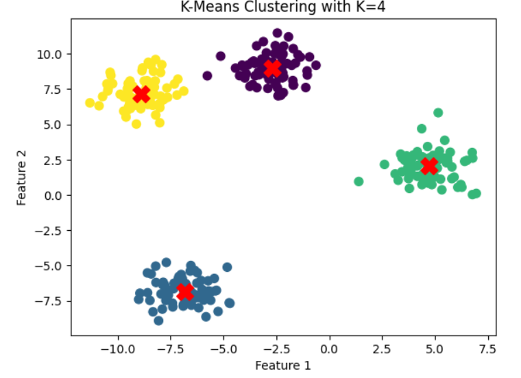
The optimal number of clusters is 4Step 7: Apply K-Means with Optimal K
Use the identified optimal number of clusters to perform the final clustering.
kmeans = KMeans(n_clusters=optimal_k, init='k-means++', random_state=42)
y_kmeans = kmeans.fit_predict(X)

# Visualize the clusters
plt.scatter(X[:, 0], X[:, 1], c=y_kmeans, s=50, cmap='viridis')
centers = kmeans.cluster_centers_  # Cluster centers
plt.scatter(centers[:, 0], centers[:, 1], c='red', s=200, marker='X')  # Highlight cluster centers
plt.title(f"K-Means Clustering with K={optimal_k}")
plt.xlabel("Feature 1")
plt.ylabel("Feature 2")
plt.show()
Summary of Steps:
- Import Required Libraries: Load necessary Python libraries for clustering and evaluation.
- Generate/Load Data: Create or load a dataset for clustering analysis.
- Visualize the Data: Optionally visualize the dataset to understand its distribution.
- Compute Silhouette Scores: Loop through a range of cluster numbers and calculate the Silhouette Score for each clustering solution.
- Plot Silhouette Scores: Visualize how the score changes with the number of clusters.
- Identify Optimal K: Select the number of clusters that yields the highest Silhouette Score.
- Apply K-Means Clustering: Use the optimal number of clusters to perform the final clustering.
- Visualize the Final Clusters: Plot the clustered data and cluster centers.
Next Blog- Hierarchical Clustering

.png)
.png)
.png)
.png)
.png)
.png)
.png)
.png)
.png)
.png)
.png)
.png)
.png)
.png)
.png)
.png)
.png)
.png)
.png)
.png)
.png)
.png)
.png)