
Tool for Data Analysis and Visualization: Tableau
Tableau is a powerful and versatile data visualization and business intelligence tool that has transformed the way data is analyzed, interpreted, and presented. Developed by Tableau Software (now a part of Salesforce), the platform allows users to connect to various data sources, analyze data, and create interactive and shareable dashboards. Tableau's user-friendly interface, robust functionality, and ability to handle large volumes of data make it a popular choice for analysts, data scientists, and business users alike.
Introduction to Tableau
Tableau is fundamentally a data visualization software that enables users to create insightful and visually compelling representations of data. With Tableau, users can perform complex analytical tasks without having to write code. The software supports a wide variety of charts, graphs, maps, and other visualization elements that help users derive meaning from raw data. Its core appeal lies in its drag-and-drop interface, which allows users to build visualizations intuitively.
One of the defining features of Tableau is its focus on helping people see and understand their data. Whether it is through static charts or interactive dashboards, Tableau provides the tools to uncover trends, outliers, and patterns in data, thereby supporting data-driven decision-making processes.
Key Components of Tableau
Tableau is composed of several products that serve different purposes. These include:
- Tableau Desktop: This is the primary development environment where users create visualizations, dashboards, and reports. Tableau Desktop comes in two versions: Personal and Professional. The Professional version can connect to more data sources and supports publishing to Tableau Server.
- Tableau Server: This is an enterprise-level platform that allows users to publish, share, and collaborate on Tableau reports and dashboards across an organization. It facilitates centralized data governance and security.
- Tableau Online: A cloud-based version of Tableau Server, Tableau Online offers the same capabilities without the need for on-premises infrastructure.
- Tableau Public: A free version of Tableau Desktop, Tableau Public allows users to publish their visualizations to the public web. It is widely used by journalists, bloggers, and data enthusiasts.
- Tableau Prep: This tool focuses on data preparation and cleansing. It allows users to combine, shape, and clean data before it is used in Tableau Desktop.
Tableau Architecture
Tableau operates on a client-server architecture and uses a combination of in-memory and live data connections to perform its operations. Users can connect Tableau to a wide range of data sources, including relational databases, cloud-based data warehouses, flat files (like Excel and CSV), and even web data connectors.
Tableau's Data Engine uses a high-performance in-memory technology known as Hyper, which enables fast querying and complex calculations. The architecture is designed to support scalability, allowing organizations to deploy Tableau in small teams or across enterprise-wide environments.
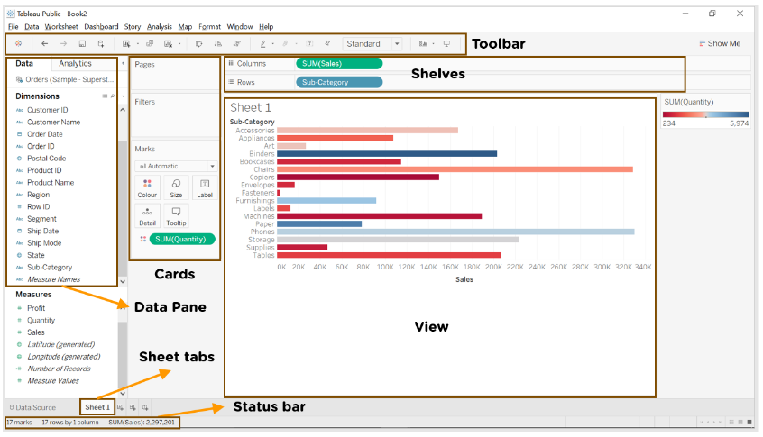
Tableau Features
- Tableau supports powerful data discovery and exploration that enables users to answer important questions in seconds
- No prior programming knowledge is needed; users without relevant experience can start immediately with creating visualizations using Tableau
- It can connect to several data sources that other BI tools do not support. Tableau enables users to create reports by joining and blending different datasets
- Tableau Server supports a centralized location to manage all published data sources within an organization
Core Functionalities
1. Data Connectivity
Tableau supports connectivity to numerous data sources, including:
- Microsoft Excel
- Text files (CSV, TSV)
- SQL-based databases (MySQL, PostgreSQL, SQL Server)
- Cloud databases (Google BigQuery, Amazon Redshift, Snowflake)
- Web data connectors and APIs
Users can choose between live connections (directly querying the data source) or extract connections (loading a snapshot of the data into Tableau).
2. Data Preparation
Data preparation is a crucial first step before creating visualizations in Tableau. Clean, organized, and well-structured data ensures accurate and insightful dashboards. Tableau offers tools for both basic and advanced data preparation tasks.
a. Filtering
Filtering allows you to limit the data that is being analyzed. You can:
- Exclude unnecessary rows (e.g., filter out null values or specific categories)
- Create filters based on date ranges, dimensions, or measures
- Use Top N filters or condition-based filters for custom selections
✅ Example: Filtering out all orders before 2022 from a sales dataset.
b. Sorting
Sorting helps organize your data to identify trends more easily.
- You can sort data in ascending or descending order
- Sorting is available by fields, such as alphabetical order for names or numerical order for sales values
- Manual sorting is also supported
✅ Example: Sorting products based on total sales, highest to lowest.
c. Grouping
Grouping is used to combine similar data entries into a single category.
- Ideal for combining multiple values into broader categories (e.g., combining ‘TV’, ‘Television’, and ‘T.V.’ into ‘Television’)
- Dynamic groups can also be created during data exploration
✅ Example: Grouping various product subcategories into a broader category like "Electronics."
d. Creating Calculated Fields
Calculated fields help derive new insights from existing data.
- You can write formulas to calculate new metrics
- Common functions include IF, CASE, DATE, SUM, AVG, etc.
✅ Example: Creating a field to calculate Profit Margin = (Profit / Sales) * 100.
e. Joining and Blending Data
To work with multiple data sources, Tableau offers:
- Joins: Combine tables within the same data source (inner, left, right, outer joins)
- Blending: Combine data from different sources by linking common fields
✅ Example: Joining ‘Orders’ and ‘Customers’ tables using ‘Customer ID’.
2. Data Preparation in Tableau Prep
For more advanced and large-scale data preparation, Tableau offers a dedicated tool called Tableau Prep.
Tableau Prep consists of Tableau Prep Builder and Tableau Prep Conductor (for automation). It enables:
a. Pivoting Data
- Convert rows to columns or vice versa
- Useful for reshaping wide or tall datasets
✅ Example: Pivoting a sales table to show months as columns instead of rows.
b. Aggregating Data
- Summarize large datasets based on groupings
- Supports SUM, AVG, COUNT, MIN, MAX, etc.
✅ Example: Aggregating total sales by region and year.
c. Cleaning Data
Tableau Prep provides several cleaning tools:
- Remove nulls and duplicates
- Fix misspelled entries
- Change data types
- Split or merge fields
✅ Example: Cleaning a ‘Customer Name’ field that contains inconsistent spellings or extra spaces.
d. Creating Data Flows
You can build a step-by-step visual data flow in Tableau Prep:
- Clearly see how your data is transformed
- Add steps for cleaning, filtering, or transforming
- Export the cleaned data to Tableau Desktop or publish it directly
3. Visual Analytics
Visual Analytics is the core strength of Tableau, allowing users to not just analyze data but also see patterns, trends, and outliers clearly. Tableau offers a wide range of visual elements to help present data in the most meaningful way.
Below are some of the most commonly used visualization types in Tableau:
Bar Charts
Bar charts are ideal for comparing different categories side by side. In Tableau, horizontal or vertical bars represent the size of the value, making it easy to identify which categories perform better or worse. This type of chart is especially useful when you need to analyze discrete data, like sales per region or number of orders per product type.
Line Charts
Line charts are commonly used for analyzing trends over a period of time. They connect data points with a line, making it easier to observe fluctuations, growth, or decline. Tableau allows you to plot multiple lines on the same graph, which is useful for comparing trends across different categories or time periods.
Pie Charts
Pie charts represent data as slices of a circle, showing proportions or percentages of a whole. While they are not ideal for detailed analysis, they work well for providing a quick visual sense of how a value is distributed among different groups — for example, how market share is split between competitors.
Scatter Plots
Scatter plots are used to visualize the relationship between two numerical variables. Each point represents an individual data item plotted on the X and Y axes. In Tableau, scatter plots help identify correlations, clusters, or outliers, which is useful for statistical and predictive analysis — such as comparing advertising spend versus sales.
Gantt Charts
Gantt charts are used for project management and scheduling. They show tasks or activities on a timeline, with bars representing the duration of each task. In Tableau, Gantt charts help in visualizing project timelines, overlapping tasks, and progress tracking — making them perfect for planning and resource allocation.
Bullet Graphs
Bullet graphs are advanced alternatives to bar charts. They show a primary measure (like actual sales), a comparative measure (like target sales), and qualitative ranges (like poor, average, good) all in a single view. In Tableau, bullet graphs are used to evaluate performance against goals or benchmarks with more context.
Tree Maps
Tree maps display hierarchical data using nested rectangles, where the size and color of each rectangle represent two different metrics. This allows you to quickly spot patterns, such as which product categories contribute most to overall sales. Tree maps are ideal for high-volume data and summarizing complex datasets visually.
Heat Maps
Heat maps use color to communicate data density or intensity. The darker or more saturated the color, the higher the value it represents. In Tableau, heat maps are commonly used to find patterns or hotspots, such as customer activity throughout the week or sales volume across different regions.
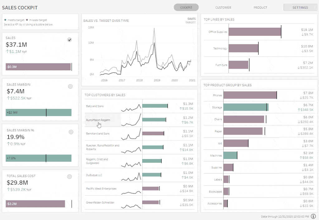
4. Dashboards and Storytelling
🔹 Dashboards
A dashboard in Tableau is a collection of multiple visualizations (charts, graphs, maps, etc.) placed on one screen. It helps users see key metrics at a glance and explore the data interactively.
Key features:
- Combine different visualizations
- Add filters, buttons, and parameters
- Make it interactive using actions (like clicking on a chart to filter another)
✅ Example: A Sales Dashboard might include charts for regional sales, top products, and profit trends — all in one view.
🔹 Storytelling
Storytelling in Tableau lets you create a step-by-step guided narrative using multiple sheets or dashboards. Each step in the story is called a “story point.”
It’s perfect for:
- Presentations
- Business reports
- Explaining insights in a logical sequence
✅ Example: A story might start with overall company performance → then zoom into regional performance → then show product-level trends.
In short:
- Dashboards = Overview and exploration
- Stories = Step-by-step explanation

5. Calculated Fields and Table Calculations
Tableau provides robust support for creating calculated fields using functions similar to those found in Excel. Table calculations allow users to perform aggregations, running totals, and percent differences directly in the view.
Advantages of Using Tableau
- Ease of Use: Tableau’s drag-and-drop interface makes it accessible even to users with no technical background.
- Speed: The in-memory data engine allows for rapid analysis and visualization.
- Integration: Tableau integrates well with a wide range of data sources and platforms.
- Scalability: Suitable for small teams and large enterprises alike.
- Interactivity: Dashboards can be made highly interactive, enhancing user engagement.
- Advanced Analytics: Tableau supports integration with R and Python for statistical modeling.
- Mobile Compatibility: Dashboards can be optimized for mobile devices.
Limitations of Tableau
- Cost: Tableau can be expensive, especially for large organizations.
- Learning Curve for Advanced Features: While basic operations are easy, mastering calculated fields, parameters, and advanced analytics may require time.
- Limited Custom Visualizations: Compared to tools like Power BI, Tableau offers fewer options for custom visuals without external tools.
- Data Preparation: Although Tableau Prep is available, the built-in data preparation tools in Tableau Desktop are not as advanced.
Use Cases Across Industries
- Retail: Analyzing sales performance, inventory, and customer behavior.
- Healthcare: Visualizing patient outcomes, treatment effectiveness, and operational efficiency.
- Finance: Creating dashboards for risk analysis, investment performance, and budgeting.
- Education: Monitoring student performance and resource allocation.
- Government: Tracking public programs, budget utilization, and demographic data.
Tableau and Business Intelligence
Tableau plays a crucial role in modern business intelligence (BI) strategies. It shifts the focus from static reporting to dynamic, self-service analytics. Organizations can empower users at all levels to explore data, ask questions, and generate insights without relying solely on IT departments.
Tableau’s ability to democratize data means faster decision-making, improved transparency, and a culture of data-driven thinking.
Conclusion
Tableau has emerged as one of the leading platforms for data visualization and analytics. Its strength lies in its intuitive interface, flexibility, and depth of functionality. As businesses continue to prioritize data as a core asset, tools like Tableau are becoming indispensable.
Understanding Tableau's theory—its architecture, functionalities, and application scenarios—provides the foundation needed to implement it effectively. Whether used for simple reporting or advanced data science workflows, Tableau remains a central tool in the analyst's toolkit.


.jpg)


.jpg)


.png)
.png)
.png)
.png)
.png)
.png)
.png)
.png)
.png)
.png)
.png)
.png)
.png)
.png)
.png)
.png)
.png)
.png)
.png)
.png)
.png)
.png)
.png)
.png)
.png)
.png)

.png)
.png)
.png)
.png)
.png)
.png)
.png)


